Introduction
Choosing a color scheme is one of the most important decisions you have to make when planning your interior design project in Nigeria. The colors you use can have a huge impact on the look and feel of your space, as well as your mood and comfort. A well-chosen color scheme can create a harmonious and appealing atmosphere that reflects your personality and style. It can also enhance the architectural and decorative elements of your space, and make it more functional and inviting. In this blogpost, we will show you how to choose the perfect color scheme for your interior design project, and give you some tips and inspiration along the way. Whether you want to create a cozy, elegant, or vibrant space, we have you covered. Read on to find out more!
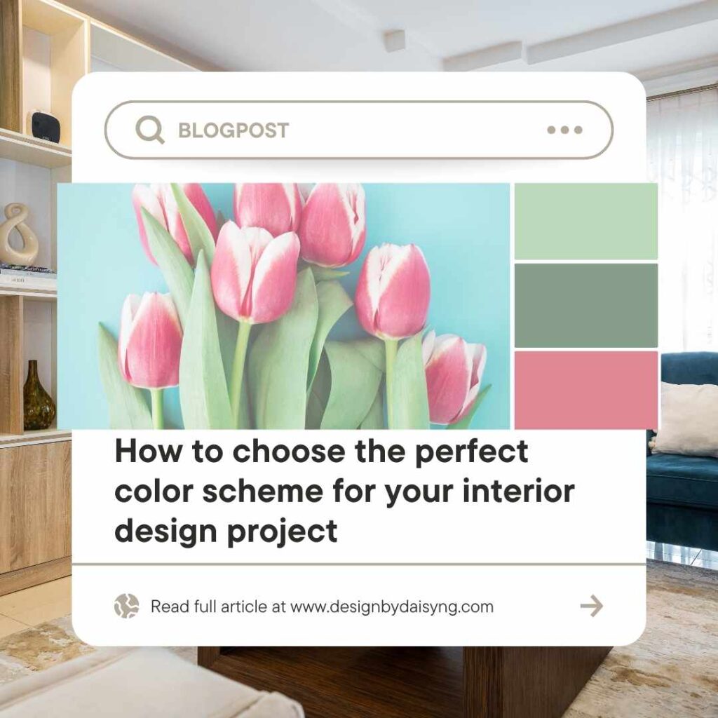
Sources of inspiration for your color scheme
One of the best ways to find a color scheme that suits your taste and vision is to look at images or items that you love. These can be anything that sparks your creativity, such as artwork, rugs, fabrics, or photos. You can use these as a starting point to pick colors that match or complement them. For example, you can choose a color scheme based on a painting that you admire, a rug that you own, or a photo that you took. You can also mix and match colors from different sources to create your own unique palette.
Another way to find a color scheme is to use some websites that offer color scheme generators or examples. These are online tools that help you create or explore different color combinations, based on your preferences or inputs. Some of the websites that you can check out are pintrest and designbydaisyng.com. These websites have plenty of tips and ideas on how to choose and use colors for your interior design project. You can also browse through their galleries of photos and videos to see how different color schemes look in real spaces.
Basic principles of color theory and how to apply them
Color theory is the study of how colors interact and affect each other, as well as how they influence our perception and emotions. To understand and apply color theory to your color scheme, you need to know some basic concepts, such as hue, value, saturation, temperature, and contrast.
- Hue is the name of a color, such as red, blue, or green. There are 12 hues on the color wheel, which are divided into three categories: primary, secondary, and tertiary. Primary colors are red, yellow, and blue, and they cannot be made by mixing other colors. Secondary colors are orange, green, and purple, and they are made by mixing two primary colors. Tertiary colors are made by mixing a primary and a secondary color, such as red-orange or blue-green.
- Value is the lightness or darkness of a color, ranging from white to black. You can change the value of a color by adding white or black to it, creating tints and shades. Tints are lighter versions of a color, while shades are darker versions of a color. For example, pink is a tint of red, and burgundy is a shade of red.
- Saturation is the intensity or purity of a color, ranging from dull to vivid. You can change the saturation of a color by adding gray to it, creating tones. Tones are less saturated versions of a color, and they can make a color more subtle or sophisticated. For example, salmon is a tone of red, and teal is a tone of blue.
- Temperature is the warmth or coolness of a color, depending on its position on the color wheel. Warm colors are red, orange, and yellow, and they can create a sense of energy, excitement, or coziness. Cool colors are blue, green, and purple, and they can create a sense of calm, relaxation, or elegance.
- Contrast is the difference between two or more colors, and it can create a sense of balance, harmony, or drama. There are different types of contrast, such as light and dark, warm and cool, or complementary and analogous.
Once you know these concepts, you can apply them to your color scheme by choosing different types of color schemes, such as monochromatic, analogous, complementary, triadic, or tetradic. These are based on the position and relationship of the colors on the color wheel, and they can create different effects and moods.
- Monochromatic color scheme uses one hue and its tints, shades, and tones. It can create a sense of simplicity, harmony, or sophistication. For example, a monochromatic color scheme of blue can include navy, sky, and baby blue.
- Analogous color scheme uses three or more hues that are next to each other on the color wheel. It can create a sense of continuity, harmony, or warmth. For example, an analogous color scheme of yellow can include yellow-green, yellow, and yellow-orange.
- Complementary color scheme uses two hues that are opposite each other on the color wheel. It can create a sense of contrast, balance, or excitement. For example, a complementary color scheme of red can include red and green.
- Triadic color scheme uses three hues that are equally spaced on the color wheel. It can create a sense of variety, harmony, or vibrancy. For example, a triadic color scheme of red can include red, blue, and yellow.
- Tetradic color scheme uses four hues that are two pairs of complementary colors. It can create a sense of richness, balance, or complexity. For example, a tetradic color scheme of red can include red, green, orange, and purple.
Tips on how to test and adjust your color scheme.
Before you finalize your color scheme, you should test and adjust it to make sure it works well for your space and your style. Here are some tips on how to do that:
- Use paint swatches, color wheels, or online tools to compare and contrast different shades of your chosen colors. You can see how they look together, and how they create different moods and effects. You can also experiment with different proportions and placements of your colors, and see how they affect the balance and harmony of your color scheme.
- Consider the effects of light, texture, and pattern on your color scheme. Light can change the appearance and perception of colors, depending on the time of day, the direction, and the source. Texture and pattern can add interest and depth to your color scheme, as well as create contrast and movement. You should test your color scheme in different lighting conditions, and with different textures and patterns, to see how they complement or clash with each other.
- Balance your color scheme with neutrals, accents, and accessories. Neutrals are colors that are not on the color wheel, such as white, black, gray, or beige. They can help tone down or enhance your color scheme, as well as create a sense of calm and sophistication. Accents are colors that are used sparingly to add a pop of color and interest to your color scheme. They can be complementary, analogous, or triadic colors, depending on the effect you want to achieve. Accessories are items that you can use to decorate your space, such as pillows, rugs, curtains, or lamps. They can help tie your color scheme together, and add personality and flair to your space.
Conclusion
Choosing a color scheme for your interior design project can be a fun and rewarding process, if you follow some simple steps and tips. In this blogpost, we have shown you how to:
- Find sources of inspiration for your color scheme, such as images, items, or websites
- Understand and apply basic principles of color theory, such as hue, value, saturation, temperature, and contrast
- Choose and explore different types of color schemes, such as monochromatic, analogous, complementary, triadic, or tetradic
- Test and adjust your color scheme, using paint swatches, color wheels, or online tools
- Balance your color scheme with neutrals, accents, and accessories
We hope you have learned something new and useful from this blogpost, and that you are ready to create your own beautiful and harmonious color scheme for your interior design project. We would love to see your results and hear your feedback, so feel free to share your photos, questions, or comments with us. Thank you for reading and happy designing! 😊